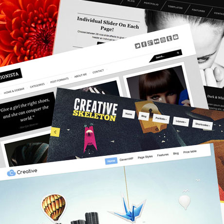
7 Stunningly Creative WordPress Themes for 2012
1. Creative Skeleton Responsive WordPress Theme
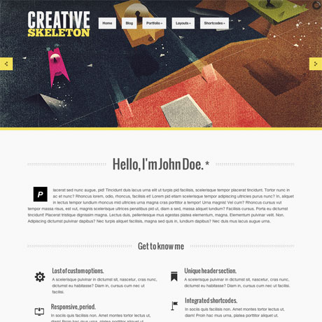
Attention Creatives! Looking for a colorful and creative theme to match your sense of creativity? If you are, then take a look at Creative Skeleton, a responsive portfolio style theme that will satisfy your colorful and artistic side. Creative Skeleton gives you several portfolio layout styles and two unique single portfolio layouts (Pile and HoverScroll) to choose from. Pile stacks your images on top of each other and brings each one to the forefront once you click on it while HoverScroll works like a carousel of images that scroll left or right when you hover on the directional arrows. All these layout configurations give you maximum flexibility to create the look and style of your online portfolio just the way you want.

Creative Skeleton Theme: $35 | Demo & Download

2. Melrose Responsive Portfolio WordPress Theme
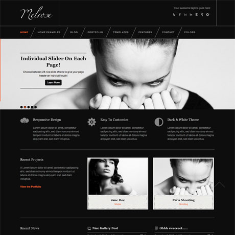
Dramatic in white and even more dramatic in black – with a myriad of accent colors to choose from – that’s Melrose Premium WordPress Theme for you. Melrose is an impressive and professional looking WordPress theme for the serious creative agency. It’s the perfect backdrop to house an equally impressive portfolio. The design elements are amazingly well-thought out and the features included will surely make you feel like you’ve bought everything in a candy store. This easy to work with, beautiful and flexible theme will definitely create a lasting impact on your visitors and eventually on your site’s conversion statistics.

Melrose Theme: $50 | Demo & Download

3. Vitrux Responsive Fullscreen Portfolio WP Theme
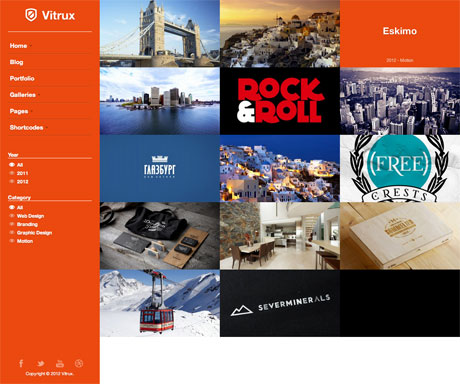
Creative Agencies and Multimedia Professionals will love Vitrux Premium WordPress Theme. Many portfolio themes include full screen portfolios on the homepage but not all of them offer full screen sliders with audio and full-screen videos as alternatives. This is what sets this portfolio style theme apart from the rest. Not only that, you also have a variety of Gallery presentation options to choose from. If you’ve amassed a large body of creative work in different multimedia formats and you want to give each project the exposure that each portfolio item deserves, check out Vitrux Premium WordPress Theme. It just might be the portfolio theme you need.

Vitrux Theme: $45 | Demo & Download

4. Fashionista Responsive WordPress Blog Theme
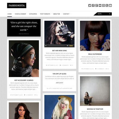
Tired of your boring blog layout and want something fresh? Why not check out Fashionista Premium WordPress Theme, a blog style WordPress theme that’s meant for bloggers but can also be used for other purposes. Pinterest-styled themes are the latest trends today and their popularity is still on the rise. Fashionista is not strictly Pinterest but uses an Isotope Masonry plugin that mimics the Pinterest look. What is interesting about this layout style is that every post is accessible and available to the visitor. This means that posts and articles are not buried in the archives where they may be forgotten – out of sight, out of mind. For bloggers, this ensures that every post gets equal exposure and importance on the homepage. Check out Fashionista Premium WordPress Theme and bring your blog style up to date today.

Fashionista Theme: $40 | Demo & Download

5. Point Break Responsive Agency Theme

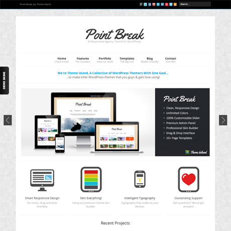
Point Break Premium WordPress Theme is a responsive portfolio theme and the sixth of the Super Skeleton Themes released by Epicera. This theme is more than just a WordPress theme because it also functions as a comprehensive HTML5 framework and a templating system as well. It’s an innovative way to creating and customizing themes and it’s primarily designed “for users, not geeks.” It’s innovative and definitely worth looking at especially if you want something that will be flexible enough to withstand the next WordPress update.

Point Break Theme: $45 | Demo & Download

6. Unique: Customizable WordPress Magazine Theme
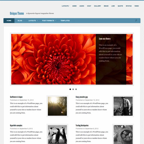
What’s so unique about Unique? We included Unique Premium WordPress Theme in our list because of the guy behind it – Justin Tadlock. This premium magazine-style WordPress theme is Justin’s first foray into ThemeForest and is part of his experiment to “improve” ThemeForest from within, with the goal of getting as many authors to adhere to WordPress coding standards and practices. Unique may not stand out as far as “looks” are concerned but its creativity lies under the hood. It’s back to good old code and just enough cool features without going overboard with the bells and whistles. Check out Unique today.

Unique Theme: $40 | Demo & Download

7. Creative Portfolio Business WordPress Theme by Gavick
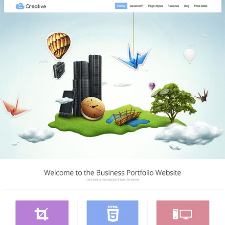
You have to see Creative Portfolio Premium WordPress Theme by Gavick in action to see what it does. This uniquely creative premium WordPress theme with parallax scrolling effect is surely going to catch the attention of your visitors and create a lasting impression. If you want to start your website with a bang or re-launch an old site with an ultra new look, then you need to check out Creative Premium WordPress Theme by Gavick. The experience will definitely be unforgettable.

Creative Theme: $99 | Demo & Download

WordPress Themes: Flat vs Skeuomorphism

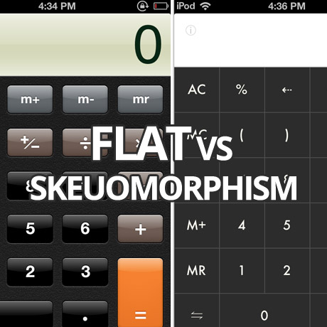
First it was responsive, and then it was retina-ready, and now it’s all about flat design. – mainstream design trends that have been embraced and integrated into a lot of current WordPress theme designs. Not exactly a bad thing especially if you are being sensitive to the demands of the target market you are servicing. Flat design (as seen in Windows 8) is the current design flavor as opposed to the more traditional skeuomorphic designs (as seen in pre-iOS 7 graphics). It is not exactly a “new” design style but it has received a lot of attention lately especially because of Apple’s recent decision to go “flat” in the latest iteration of iOS. Let’s dive a little deeper.

Skeuomorphism Defined

Skeuomorph, , or skeuomorphism – n. (Pronunciation: /?skyo?o??môr?fiz?m/)
Skeuomorphism refers to a design principle in which design cues are taken from the physical world. This term is most frequently applied to user interfaces (UIs), where much of the design has traditionally aimed to recall the real world – such as the use of folder and files images for computer filing systems, or a letter symbol for email – probably to make computers feel more familiar to users. However, this approach is increasingly being criticized for its lack of ingenuity and its failure to pioneer designs that truly harness a computer’s superior capabilities, rather than forcing it to merely mimic the behavior of a physical object.

The term skeuomorphism is derived from the Greek words “skeuos,” which means vessel or tool, and “morphe,” which means “shape.”
(source: Techopedia.com)

Flat Design Defined

Flat design is a minimalistic design approach that emphasizes usability. It features clean, open space, crisp edges, bright colours and two-dimensional/flat illustrations. In flat design, ornamental elements are viewed as unnecessary clutter. If an aspect serves no functional purpose, it’s a distraction from user experience. This is the reason for the minimalistic nature of flat design. (source: creativebloq.com)

Flat design is a technique that uses simple effects – or lack thereof – to create a design scheme that does not include three-dimensional attributes. Effects such as drop shadows, bevels, embossing and gradients are not used in flat design projects.
Some call the look of flat design simple, although it can be quite complex. The look itself is simple, direct and user-friendly, making it an increasingly popular option for mobile user interfaces as well as trendy web design. (source: designmodo.com)

The Debate – Old Ornate vs. The New Cool

Many designers argue for or against either one of these design styles. It is an ongoing debate in design circles and the discussion has sometimes been heated and enlightening at the same time. Aside from the obvious difference in looks, visual designers have taken to flat design in response to technology. Not only is it quicker to design but also the smaller file sizes of these design elements allow for faster loading and a more efficient UI experience. As the web becomes more mature and more distinct in its visual language, the use of these flat design elements will become more instinctive and less dependent on graphics that imitate real life.

WordPress and Flat Design

WordPress designers have already been incorporating flat design into many of the WordPress themes that are coming out. Minimalist, clean, simple graphic elements are common in several of the newer theme releases. Excessive shadows, real world things, 3D effects, gradients are a few of the effects that have been greatly reduced and have given way to cleaner, simpler, colorful, light and modern elements.

Which one is better?

Some people like log cabins while others prefer IKEA-styled homes. We can’t say one is better than the other because it is a matter of personal preference. As far as designing WordPress themes for a specific market goes, one market will prefer the minimalist look while another will be wowed by a 3D, parallax powered, visually stimulating theme. Some are even drawn to crowded design. The choice belongs to the consumer. And the consumer will buy whatever matches his or her preferences and meets his or her goals and objectives. What may seem beautiful to one client can look disgusting and awful to another.

WordPress professionals who create WordPress themes and sell them in the marketplace are subject to the whims of of the consumer. No one can really predict which theme will be a smashing hit once it is released. However, delivering a product to the market that is consistent with one’s design sensibilities and high standards of quality will always find its target market match somewhere along the way.

Share your thoughts. We’d love to hear from you.


Portfolio WordPress Themes for December 2013

Gear up for the year-end and display your holiday photos or your best creative work with these flexible and dynamic portfolio WordPress themes for you or your clients. Check these out:

Sonnet – One Page Parallax Multipurpose Portfolio

Sonnet Premium WordPress Theme is a clean and streamlined One page Parallax Responsive Business Template built with Bootstrap 3.0.2, HTM5 & CSS3. This flat, easy to customize theme with its well-placed content blocks boasts of professional coding as its core power. Also included are Visual Composer – the most popular & powerful drag and drop layout builder for WordPress, a powerful section editor, responsive grid portfolio plugin – Megafolio, Zilla Shortcode, a Pricing Table manager among others. This premium theme supports Automated Plugin management and even includes a demo content importer which will let you build the site with dummy content in a second.

Mocha Flat Bold WordPress Portfolio Theme

Mocha Premium WordPress Theme is a unique and bold portfolio WordPress that is aesthetically clean, flat, minimalist in design ideal for any design agency, creative professional, freelance designer, photographer, or anyone in the creative industry wanting to make a good impression on clients. It’s very flexible and is powered with Bootstrap framework. This premium WordPress theme has advanced theme options with unlimited styling options, unlimited colors, 500+ Google Fonts, a Visual Shortcode manager, and tons of other features to help you fully customize your website. This premium theme is WordPress 3.6 and 3.7 compliant.

Mercury Responsive Portfolio Photography Theme

Mercury Premium WordPress Theme is a clean, minimalist parallax style portfolio theme that can be used for any portfolio, photography or business website. Features include responsive design which adapts to mobile devices (iPhone, iPad) and can be deactivated with one click in your backend, it is retina ready for ultra-sharp high resolution graphics, sticky main menu navigation, off-canvas mobile navigation, drag & drop content builder, 20 gallery templates, 6 portfolio templates, filterable portfolios, instant AJAX search, Music support for gallery pages, Password Protected Gallery Support, Image Gallery Comments Support, Fullscreen Youtube and Vimeo video support, and a whole lot more.

Upward: Experimental Portfolio & Blog

Upward Premium WordPress Theme is a unique experimental responsive, retina-ready WordPress theme using pseudo-elements to create a distinct presentation style on original browsers (Firefox and Chrome) unlike any other theme. Usually, non-original browsers (like Safari for Windows) do not support anti-aliasing of pseudo-elements. Also, not all browsers support CSS3 animation completely, thus some part of animation isn’t available in IE8-9, Safari and Opera. Other than that, this premium theme includes important features like: light and dark skins, post/page options, powerful visual shortcodes, unlimited sidebars, unlimited fonts, and so much more.

Nervaq – Responsive One Page WordPress Theme

Nervaq Premium WordPress Theme is a fully responsive Ajax-powered, parallax one page portfolio template with a modern, clean and minimalistic design ideal for creative agencies, designers, freelance creatives, and those in the creative industry. This premium theme is highly optimized for both mobile and desktop platforms, it uses lazy-loading of images assets and compression of all required scripts. Other features include: Drag and drop gallery management, localization ready, and is built on a full OOP , modular, load-on-demand, WordPress framework.

Grido: Responsive and Multipurpose Grid Portfolio

Grido Premium WordPress Theme is a minimalistic theme ideal for creative professionals that love flat and clean design. Its stunning design and layout capabilities with excellent color (ten preset) and typographic choices will give your portfolio the attention that it deserves. This premium responsive theme is highly customizable using the dedicated control panel and is a highly flexible and widgetized theme, packed with WordPress features such as post-formats, page templates, custom widgets, shortcodes, including important features specifically designed for it. It is also Themelovin plugins compatible: Themelovin Dribbble, Themelovin Portfolio, Themelovin Shortcodes, Themelovin Team, Themelovin TwitterIt.

Dirty Saloon – A Rugged One Page WordPress Theme

Dirty Saloon Premium WordPress Theme is a Cowboy Western-inspired premium responsive Theme that will surely make you hold your horses. This unique, flexible, and freshly designed theme features innovative AJAX loading of Posts and Portfolio items which can be turned on and off on demand with one click in Page Builder. It features a premium Aqua Page Builder for easy creation of new pages for your site.The theme also comes with a Revolution Slider, a convenient Administration panel, and many more.


Useful WordPress Widgets For Your Website

Not sure which widgets to add to your website? Widgets are handy tools or content that make it easy to customize the content of your sidebar(s). You can add, arrange, and remove them from the sidebar(s) of your blog according to your design and function preferences. Here are some useful and popular widgets to beef up the overall functionality of your WordPress theme.

Sidebar and Widget Manager

This powerful widget manager allows you to have full control over your WordPress theme pages, layouts, and content and turn them into widgetized, responsive layouts. With its easy to use grid manager, this tool allows you to drop and drag widgets into any part of the page. You can replace existing sidebars with custom ones, add a sidebar in a page template file, manage vertical and horizontal widget alignment, and so much more. This widget supports other popular widgets such as WooCommerce, WPML, BuddyPress and BBpress. Designed to fit into the core WordPress design, the Sidebar and Widget Manager requires easy administration with minimal fuss.

Taxonomies Filter Widget

Taxonomies Filter Widget is a robust but powerful WordPress plugin that creates a widget which acts as a filter for your categories, tags, taxonomies and numerical custom fields. Visitors will then be able to do faceted searches on your site to filter posts and pages by taxonomies and numerical custom fields, using drop-downs, checkboxes, radio buttons, multi select and range sliders. While built especially for sites with a variety of categories, custom taxonomies and custom posts (eg: shops, directories, tutorials, job boards or listings), this plugin will also do a great job at filtering the WordPress posts and pages by categories, tags and even post format. Search can be done using dropdowns, checkboxes, radio buttons, multi-select and range sliders. Hierarchical navigation is also possible, allowing readers to drill down to specific information.

Popular Posts Bar Widget

This two-in-one widget allows you to show trending posts by comments or views according to a custom time interval, in say, the last 7 days. What makes this Popular Posts Widget unlike the rest is that it displays your most popular posts in a bar format. You can customize the number of posts to be shown or set a time lapse filter to show only those related to a specific time frame. The graphic display engages the curiosity of visitors thus encouraging them to check out the most popular posts in your site. The widget also gives out information on how many visitors have checked out your posts which can prove valuable to you as a provider of content.

Twitter Ultimate WordPress Plugin

Twitter Ultimate is a user friendly, highly customizable WordPress plugin you can use to display real time twitter feed based on the search word / username / list entered. You can: display tweets from usernames or tweets mentioning a word, display tweets from multiple queries or usernames, control number of tweets to be shown in the feed, control speed of incoming tweets, embed the widget directly on your pages or posts, etc. This gives you real time, live feedback for a specific post or page.

Hello Ajax Tabs

“Hello ajax tabs” is a WordPress plugin, which can be used for creating tabs element from any widgets you have. This plugin comes with 16 predefined styles and 23 animation effects, ajax support, multi tabs support, easing support, vertical tabs support, menu width and height adjustment controls for vertical tabs, fixed height support, other useful features to ensure you can create the tabs you need.

Dropbox Frontend Slider

The Dropbox Frontend Slider widget allows you to display dropbox images directly on your website. You can display these images either using the flexslider without effects or create your own effects. You can also choose between various frontend image sizes, choose the direct URL from Dropbox where the images are located, add or edit your dropbox images and immediately see the changes coming up on the frontend, etc.


WordPress Plugins To Try This September 2013

Enhance your WordPress site with these useful plugins that will help beef up features and functions you already have:

Ajax Portfolio Grid for WordPress

Ajax Portfolio Grid plugin allows for smooth loading and reloading of pages because of its Ajax feature. Features include: flexible columns, Youtube and Vimeo support, Drag and drop support, and hardware accelerated touch swipe support among a few. This robust plugin is built around the MVC core and makes full use of HTML5, CSS3, PHP 5.2+, and jQuery 1.7 – latest technologies that allow it to render fast and lightweight results including effects that are responsive and adapt to most if not all handheld and mobile devices.

Paper Grid

Paper Grid is a lightweight and powerful content grid plugin for WordPress that allows you to showcase your team, your services and products, or any other type of content in a dynamic and interactive way. You can select images, icons, change colors and you can also easily share your team members or even content on your social networking sites. The Content Grid frontend css file is only 5 KB and the javascript file is only 2KB making it really lightweight which means your website’s loading performance will be fast.

Mobile.nav

Mobile.nav is an easy to install and easy to use mobile and responsive navigation menu plugin for WordPress that creates an awesome mobile menu for your website. It supports top level + nesting up to 3 sub levels (4 levels totally) but can expand to how many you need by copying few lines of css. This plugin uses the native WordPress built-in design language and easily integrates with the WordPress menu system and supports expanding menu tree. Mobile.nav works on iOS, Android and Windows Mobile.

Hashtag for WordPress

The Hashtag WordPress plugin uses the new auto-complete system in the WordPress editor which allows you to set up an integrated hashtag system for your website. You can easily add a hashtag (#word) in your posts based on # character and on other hashtags already existing on your site. This plugin filters all the sentences containing the hashtag and displays them with links and thumbnails to the related posts. The #hashtag word link and the #hashtag page can also be easily customized (font, border, radius, padding, margin, etc.) according to your preferences.

FormCraft WordPress Form Builder

Create your own stylized forms with FormCraft WordPress Form Builder plugin – an AJAX powered form interface that allows you to create responsive forms and add as many as 23 fields (conditional or not), add multi-columns, save form progress, generate form analytics, integrate MailChimp, Campaign Monitor and Aweber and send to auto responders, embed objects, maps and videos, upload multiple images (retina-optimized), add form validation, get all submissions in your inbox, and many other useful features.

Frontend Builder

Frontend Builder WordPress plugin allows you to design your web page using intuitive frontend and backend options and a drag & drop system that allows you to add all the content that you need regardless of the template that you are using. This plugin is an easy-to-use solution for all users regardless of their skill level whether as designers or developers. Developers will find this plugin useful because they can assign this plugin to their templates with their own shortcodes and enable their potential users to design their own web pages using their own template’s elements. Other features include: clone options, WordPress shortcodes, pre-made UI system, live preview, and tons of other options.


30 Creative Business WordPress Themes

For a successful business an outstanding site plays a major role, Today a lot of creative professionals have realized this and use Word Press as the engine for building an online site. The ease of use of WordPress, the high number of portfolio styled themes and plugins available for building a professional portfolio web site makes the decision easy.  (more…)


25 Excellent WordPress Tumblog Themes

Tumblr is a popular micro blogging platform where people can make small posts, share links and images with others, reblog the posts of others, etc. It is a platform that sort of combines the features of a blog with social networking.
(more…)


M-Commerce – The Mobile Market, Web Design and Conversion

The unstoppable invasion of mobile computing and how it has woven itself into our daily routines is undeniable. A life without the Internet, free WiFi, and our handheld devices is almost unimaginable and web designers have heard and heeded this lifestyle change, hence, the birth of responsive, fluid, and liquid design trends. Mashable has even named 2013 “The Year of Responsive Design”. However, we are still in the early stages of understanding this mobile demographic to yet see tangible and consistent conversion results from the marriage of Mobile Commerce (M-Commerce) and Web Design for handheld and mobile devices. Responsive design does not necessarily equate to actual conversion, whether in sales, subscriptions, or networking.

According to a report by Litmus.com,

“More email is read Mobile than on a desktop email client or via webmail. Stats say 36% of email is now opened on a mobile device, with 33% for desktop and 31% for webmail.” – Litmus –”Has your audience gone Mobile” (June 2012)

As of September 2012:

We’ve seen some major changes in mobile email opens in the past year and a half. As of September 2012, 38% of all opens were on a mobile device, compared to only 17% eighteen months ago—that’s a 123% increase in mobile opens!

Diving deeper into specific mobile operating systems, the majority of these opens are being made on iOS (iPhone and iPad – 80.34%) and Android (18. 93%) devices:

The next question is, Does Mobile Traffic Convert into Leads?

Not necessarily so. There are several factors that lead to actual traffic conversion and there is no hard and fast rule on it but website owners can make educated guesses based on actual data and stat results gathered from their own website traffic trends.

Three ways to reach your target mobile traffic:

Run a native mobile app

  • Needs to be downloaded by the user
  • Restricted amount of content and functionality

A mobile website or M-Dot (a dedicated scaled down mobile version of the main website)

  • Advantage – faster loading time and optimization
  • Disadvantage – two bodies of content to manage

Responsive web design

  • Uses responsive, fluid, liquid layouts, media queries, and flexible images to adapt to various devices and resolutions
  • More future friendly
  • One body of content to manage
  • Consistent brand experience
  • Social media friendly

Among all three, responsive web design appears to be the most feasible way of reaching your target market. But is responsive web design enough to address the problem of conversion?

Here are some strategies to consider to maximize your web design and marketing optimization efforts to improve your conversion rates on your website:

Create a mobile optimized landing page

  • Make sure that your landing page is displayed properly on all screen sizes (portrait and landscape)
  • The need for speed – achieve fast loading time (5 seconds or less) by using optimized media content (images, video, and audio) and scripts.
  • User friendly – Prospects don’t have to type anything just click a button. If possible, must be clickable by the thumb.
  • Content must be simple, readable and easily navigable. Call to action buttons must be prominently but strategically located.

Create a mobile optimized order form

  • Redirect users from the landing page to your mobile optimized order form.
  • Form fields should be easy to read and fill out on any mobile device. Longer forms lead to boredom and lower conversion rates.
  • Remove all sidebar content so the form fits perfectly on the viewable window of the mobile device

Create several versions of your landing pages and order forms and test which ones convert the most. Improving User Experience and establishing a User Friendly Interface all contribute to an enjoyable browsing experience for your mobile visitors which will eventually boost your conversion results.


Beautiful WordPress Technology Themes For Inspiration

Imagine a world without technology. Difficult, isn’t it? No Internet, no computers, no cell-phones, no TV. Surely technology makes our lives easier and more technology makes our lives even easier. New inventions are made every now and then and they need the word to spread so that more and more people will know about them and may use them. In today’s world the Internet is one of the best options available to spread the word about anything. Other aspects like TV commercials, print media ads, posters, etc. are somewhat limited in the sense that they do not provide the “complete information” about a product.

(more…)